![]()
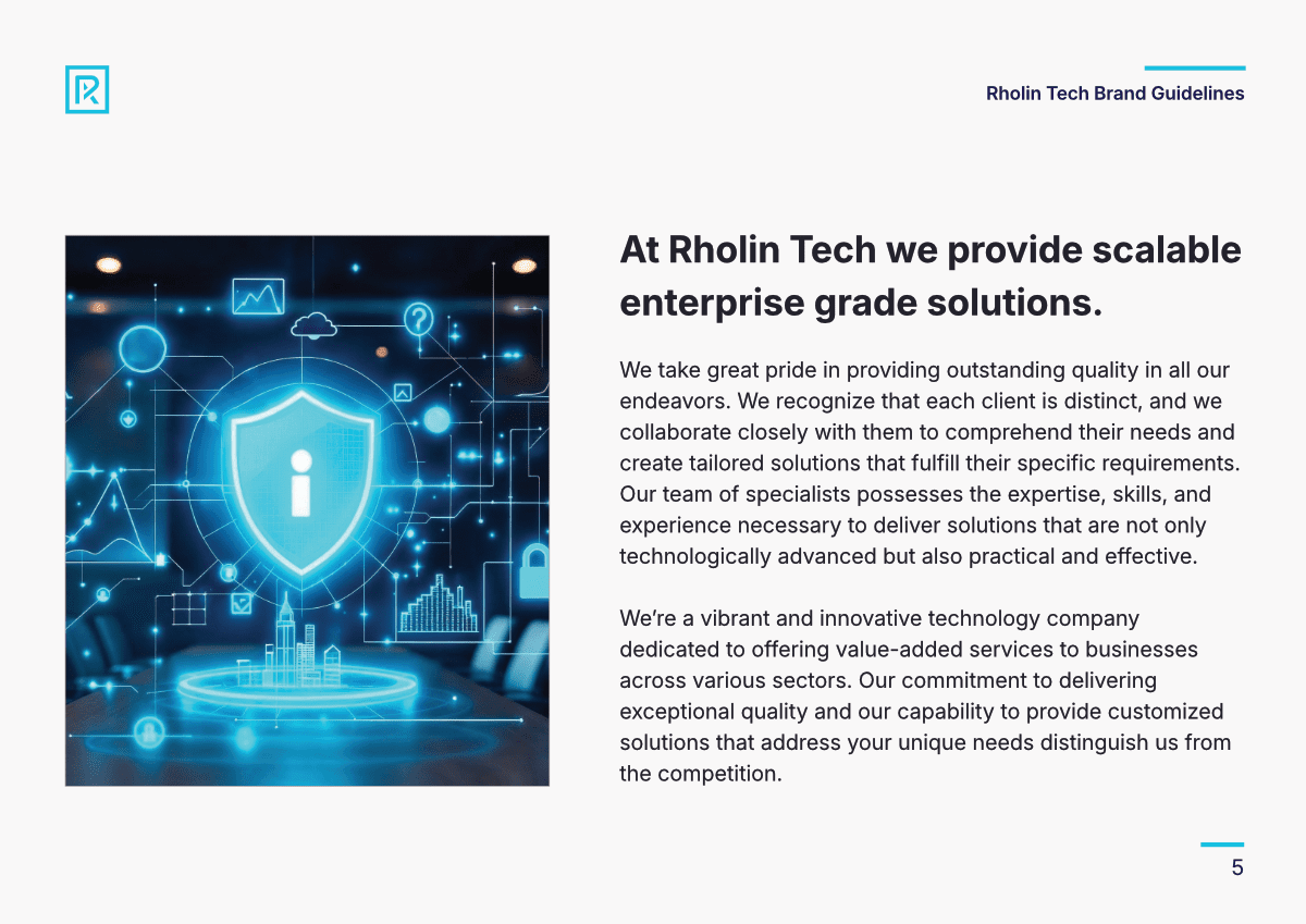
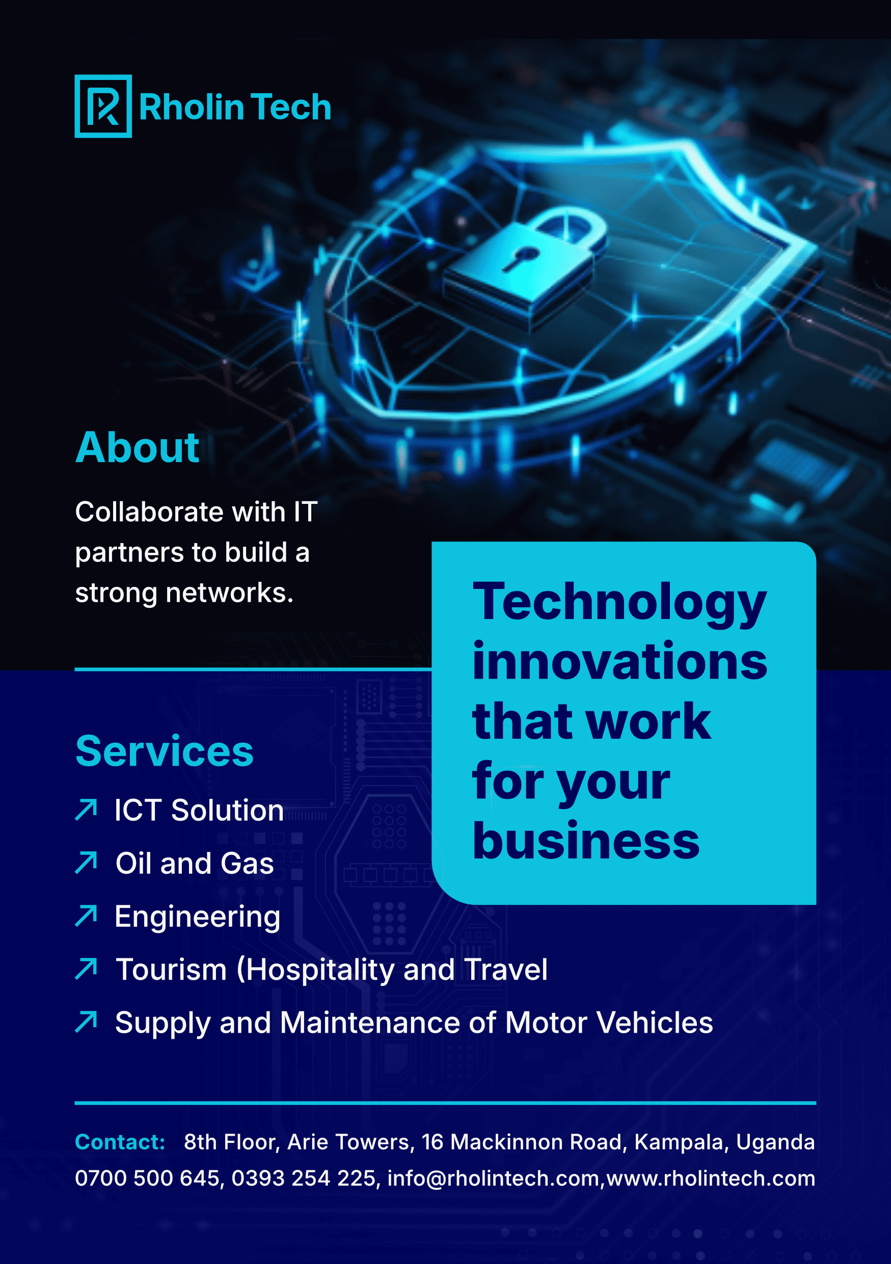
Rholin Tech, a vibrant technology company based in Kampala, Uganda, required a cohesive brand identity and a high-performance digital presence to reflect its status as a provider of scalable, enterprise-grade solutions. The goal was to establish a visual language that communicates innovation, reliability, and professional excellence across multiple sectors, including ICT, Engineering, and Energy.
Phase 1: Brand Identity & Visual Systems
The foundation of the project was the creation of a comprehensive Brand Style Guide to ensure honesty and consistency in every customer interaction.
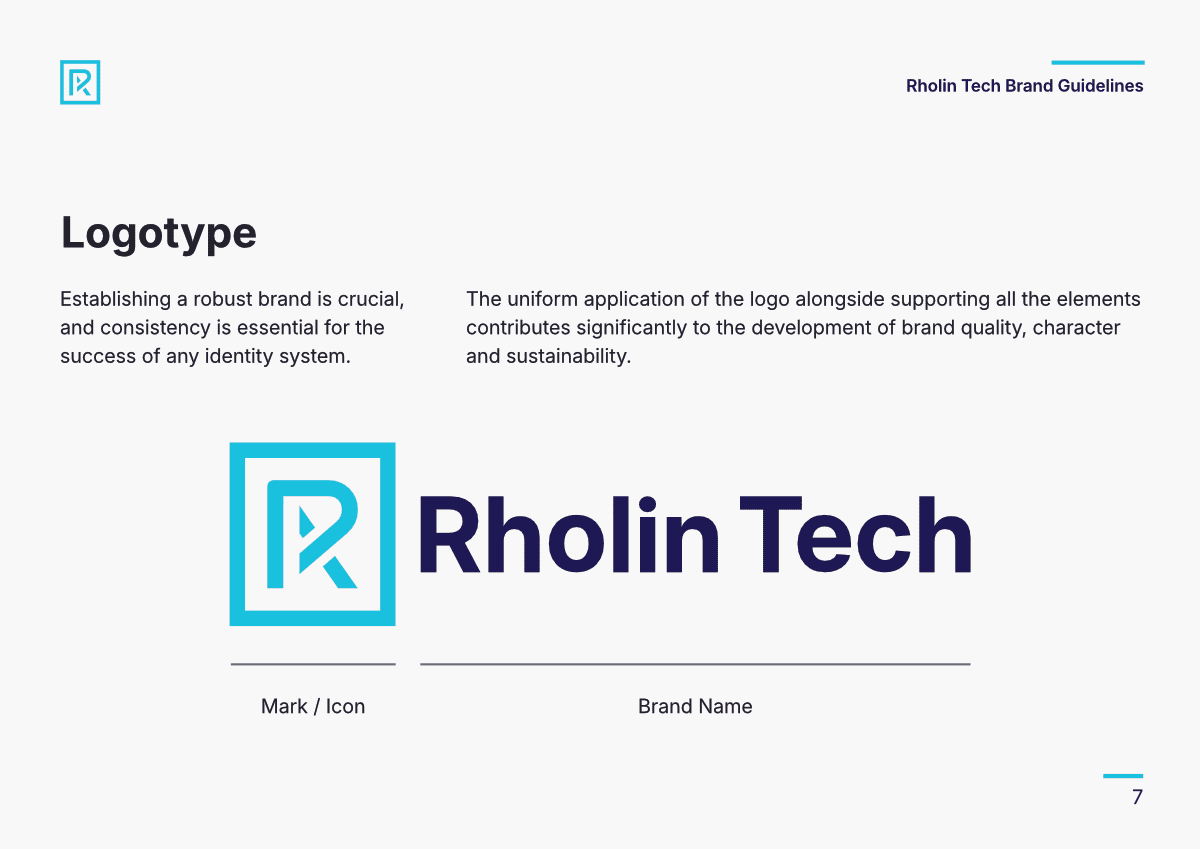
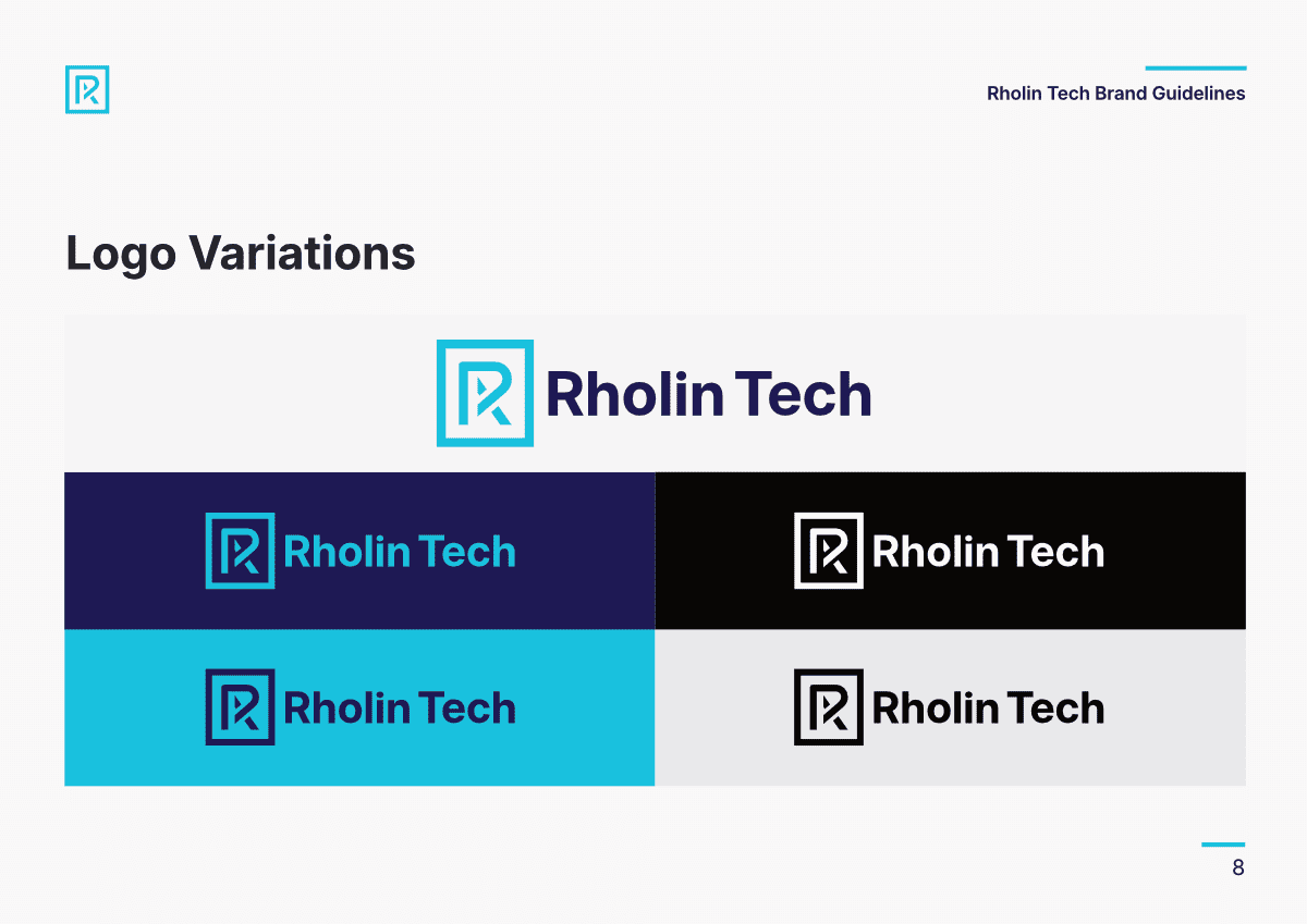
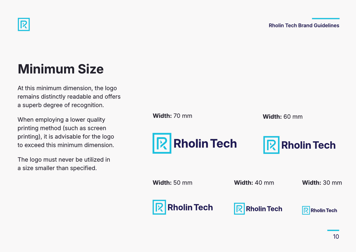
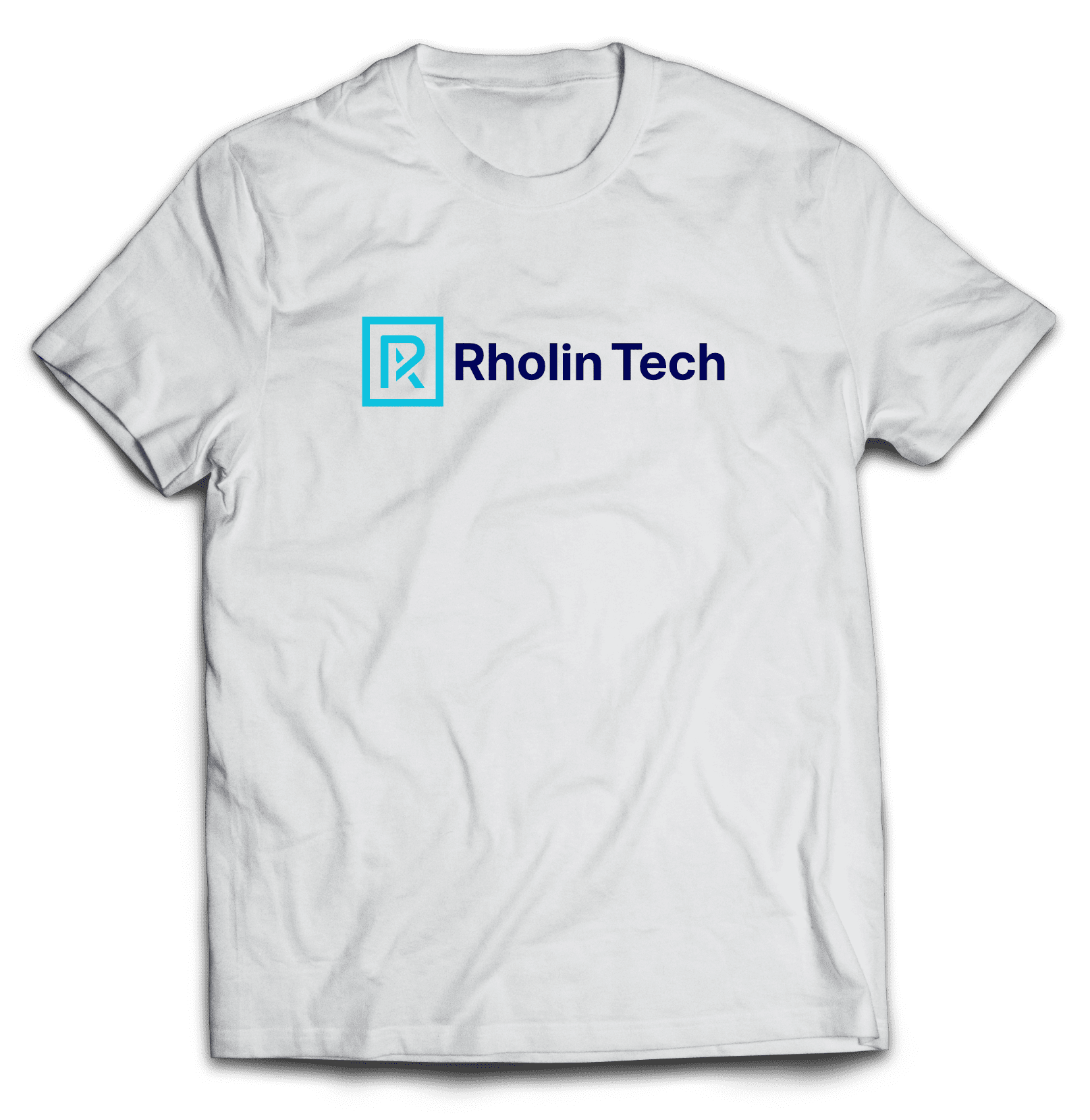
- Logotype: A modern, minimalist mark featuring a stylized “R” icon paired with clean typography. The system includes specific variations for vertical and horizontal placement, with strict “clear space” rules to maintain visual impact.
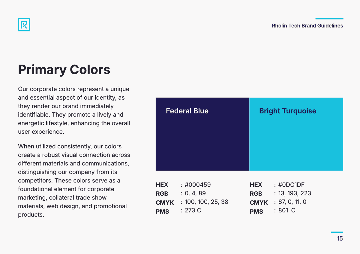
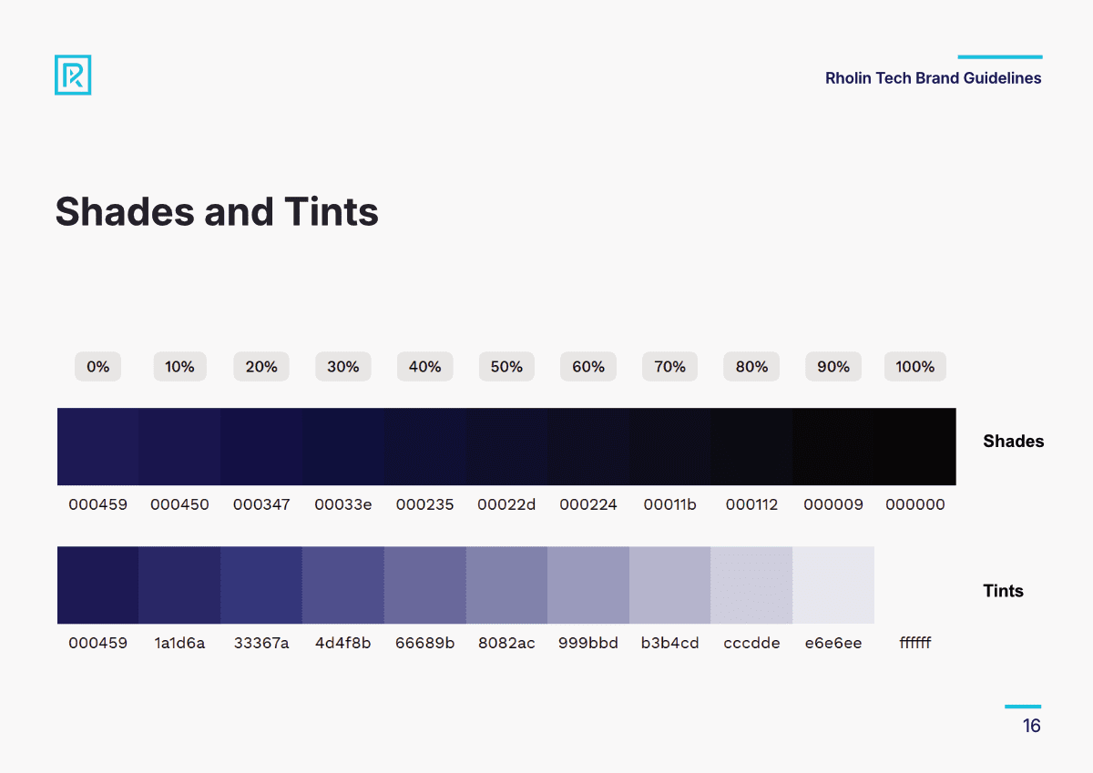
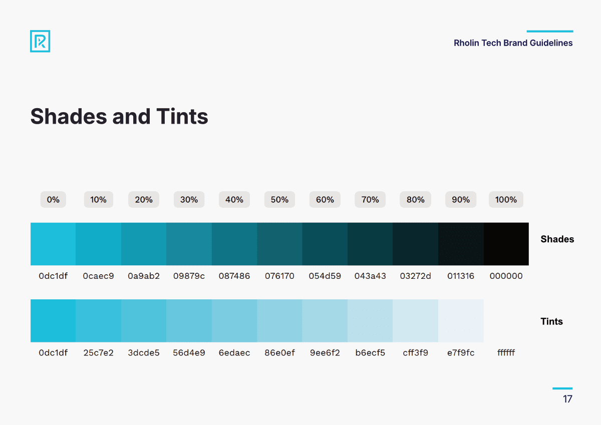
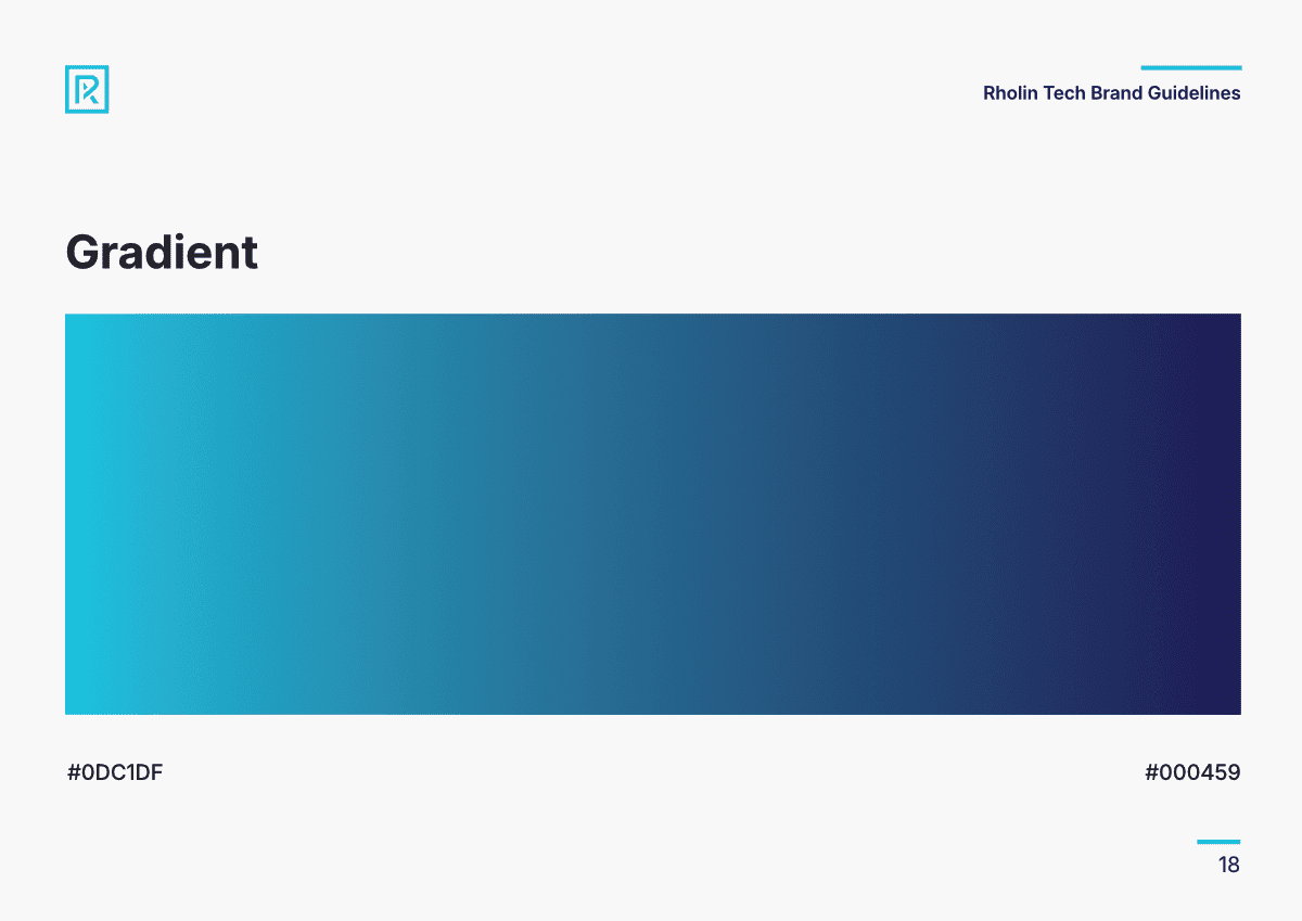
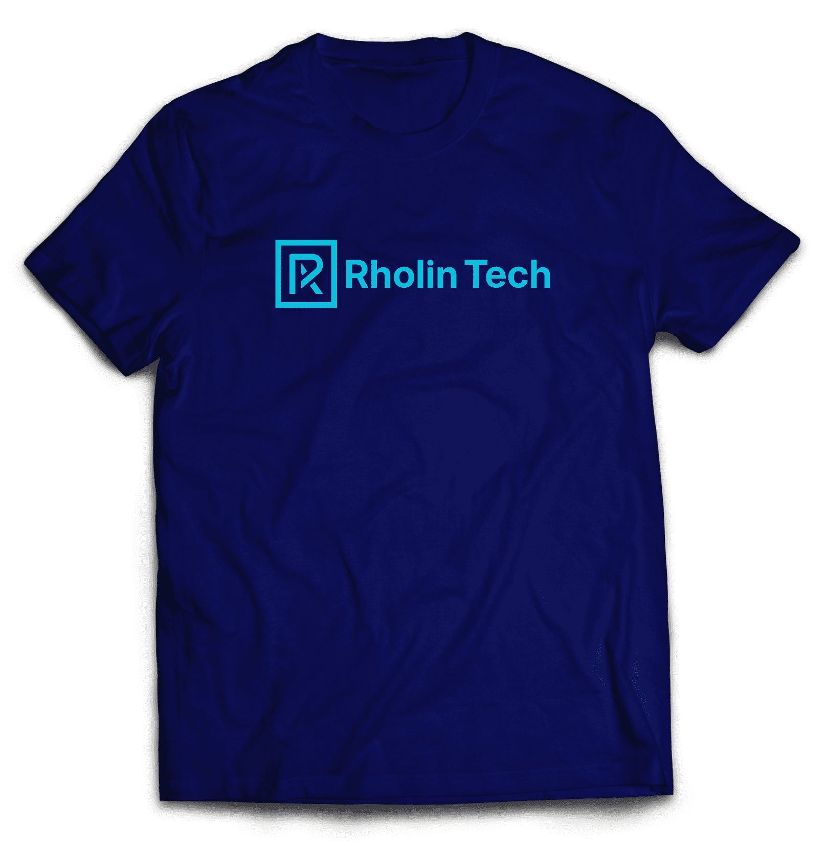
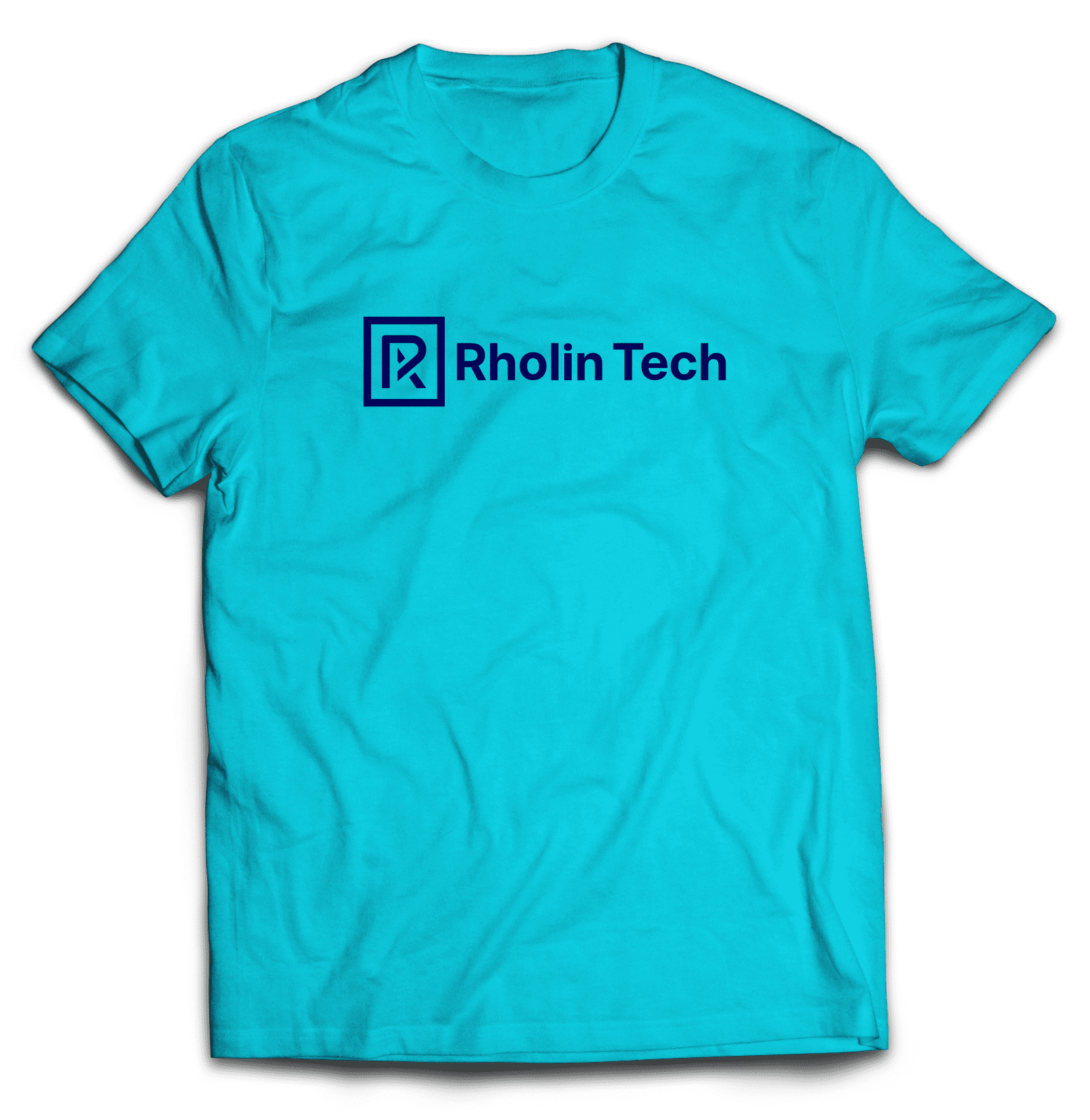
- Color Palette: A professional and energetic scheme led by Federal Blue (#000459) for stability and Bright Turquoise (#0DC1DF) for innovation.
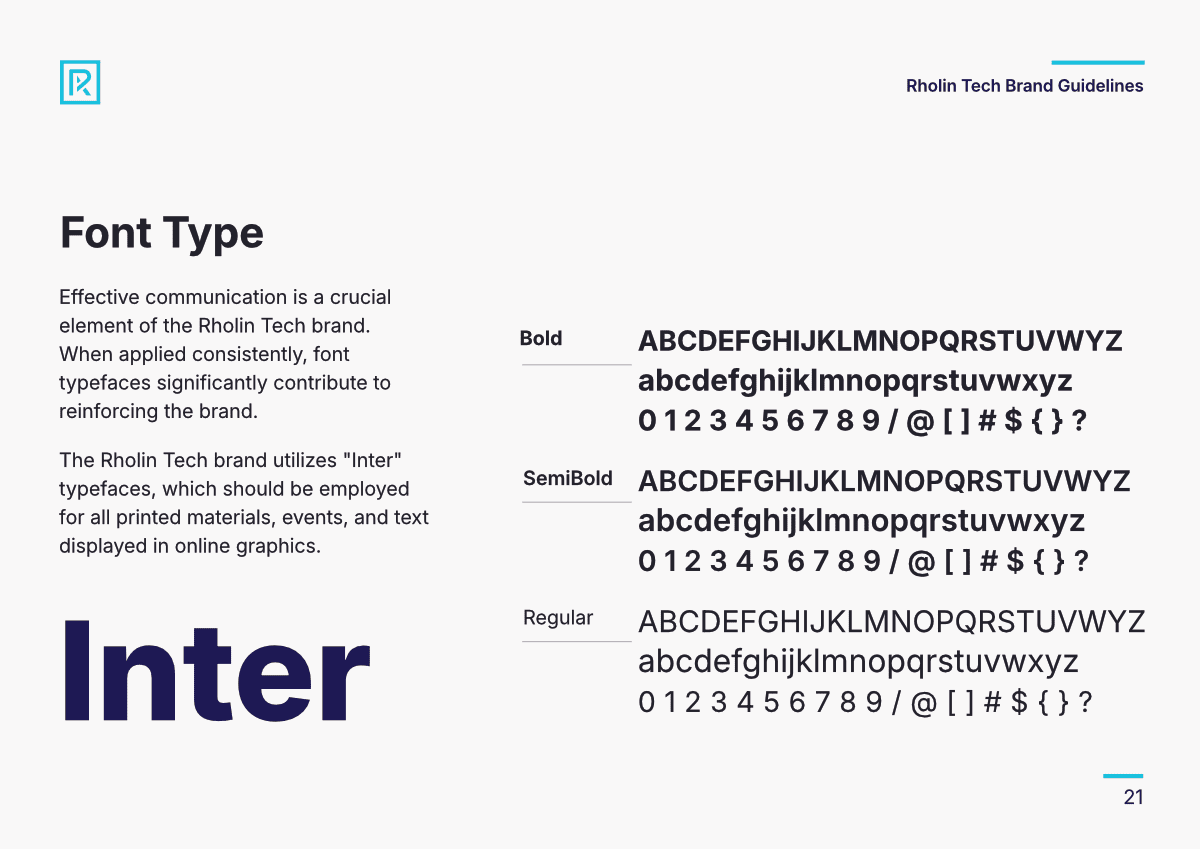
- Typography: The Inter font family was selected for its exceptional readability across both print and digital applications, utilizing various weights (Bold, SemiBold, Regular) to create a clear information hierarchy.
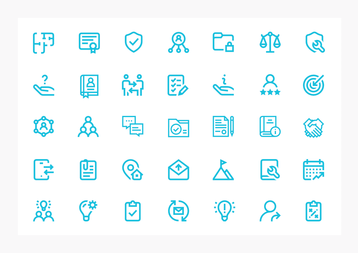
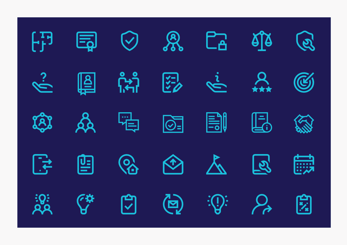
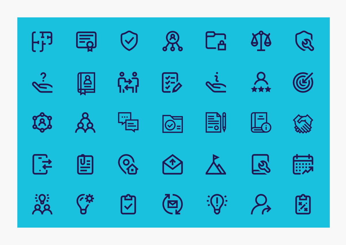
- Iconography: A custom set of geometric icons was developed to visually segment complex technical content, making services more accessible to the end-user.
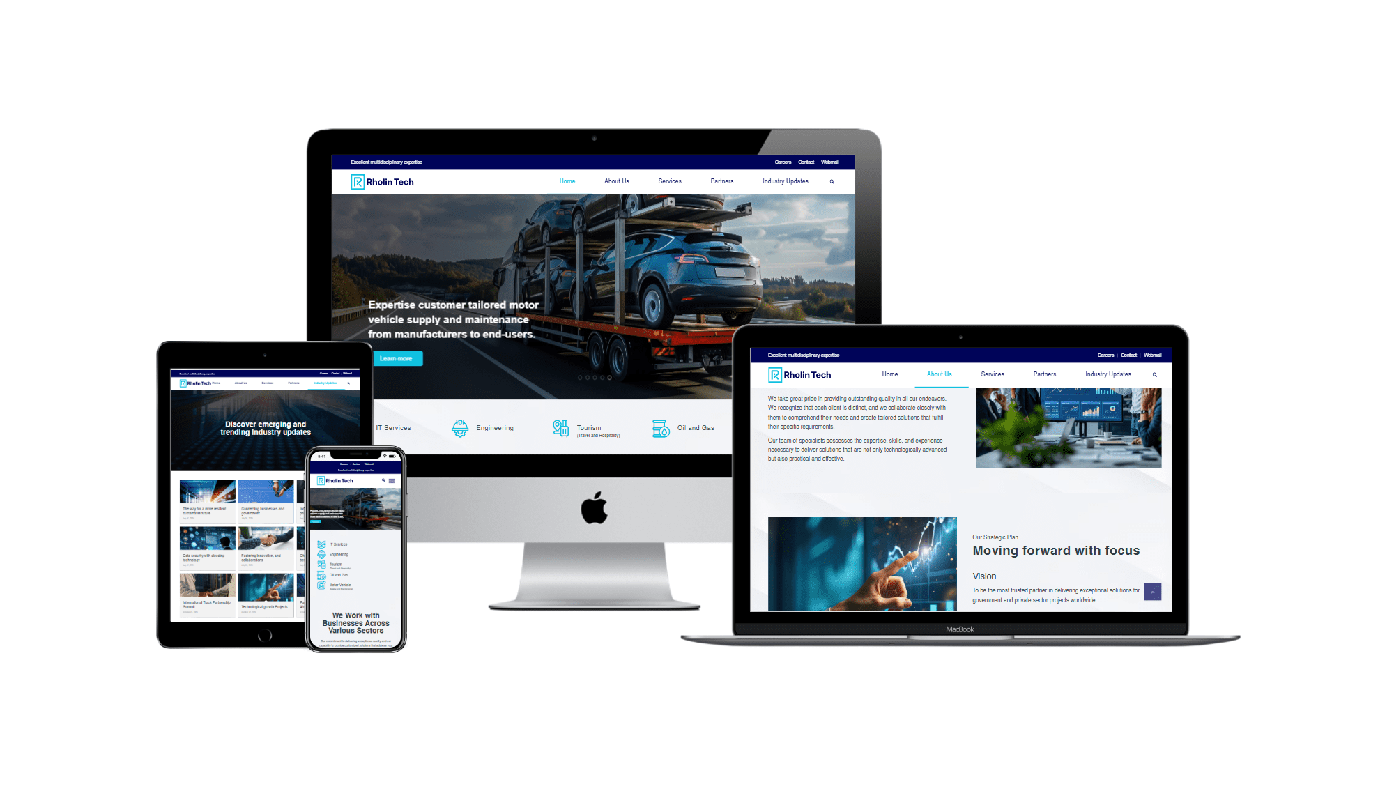
Phase 2: Website Design & Development
The digital strategy focused on creating a “function-first” platform that balances technical sophistication with ease of use.
- User Experience (UX): Prioritizing simplicity, the site uses a 1200/960 grid structure to ensure effortless navigation and a clear presentation of Rholin Tech’s diverse service portfolio.
- Responsive Engineering: The website was built with a mobile-first mindset, ensuring the brand identity—including logo proportions and font legibility—remains intact across desktops, tablets, and smartphones.
- Visual Continuity: By integrating the “Inter” web font and the primary brand gradients, the digital experience serves as a direct extension of Rholin Tech’s physical brand collateral.
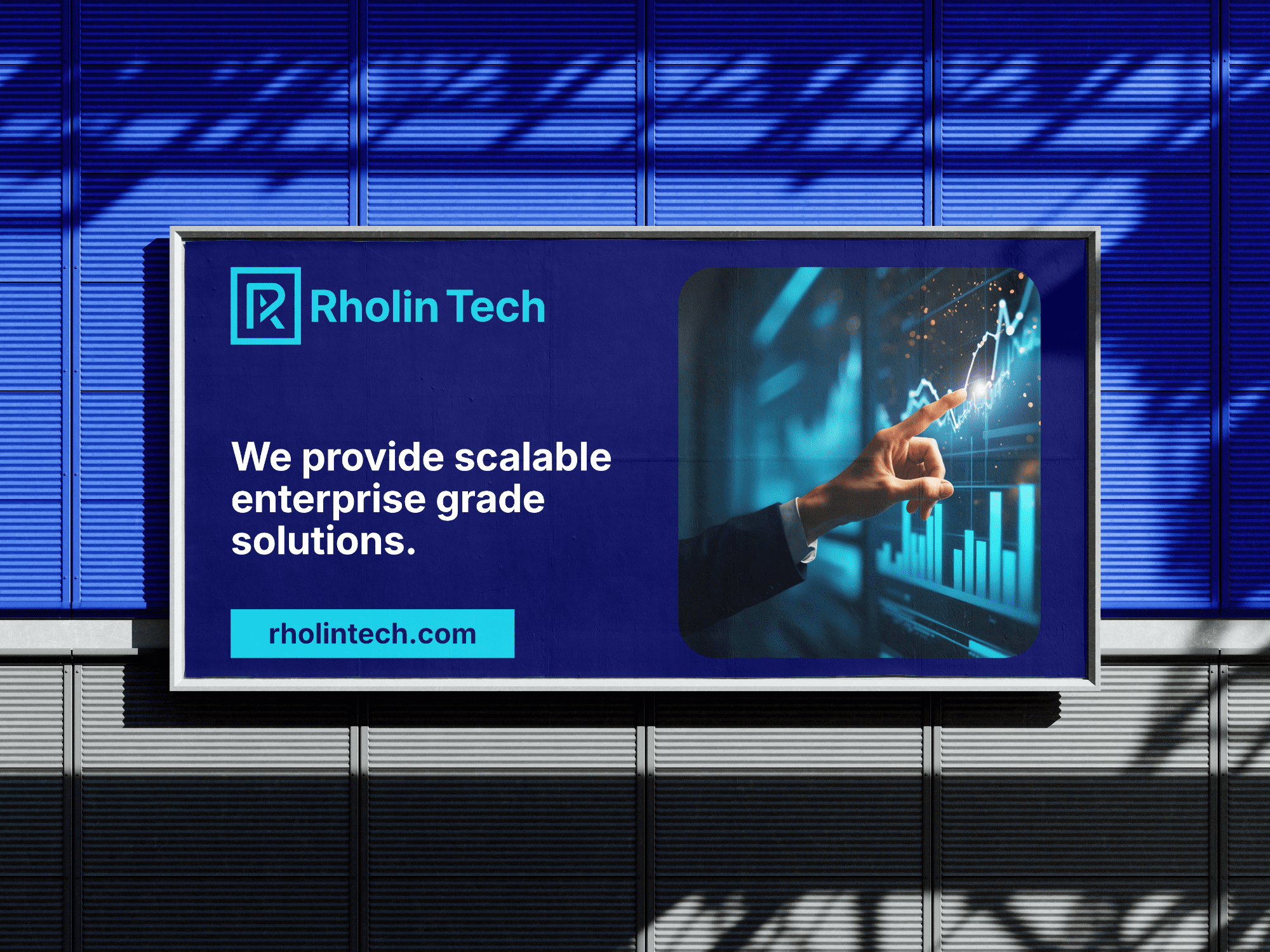
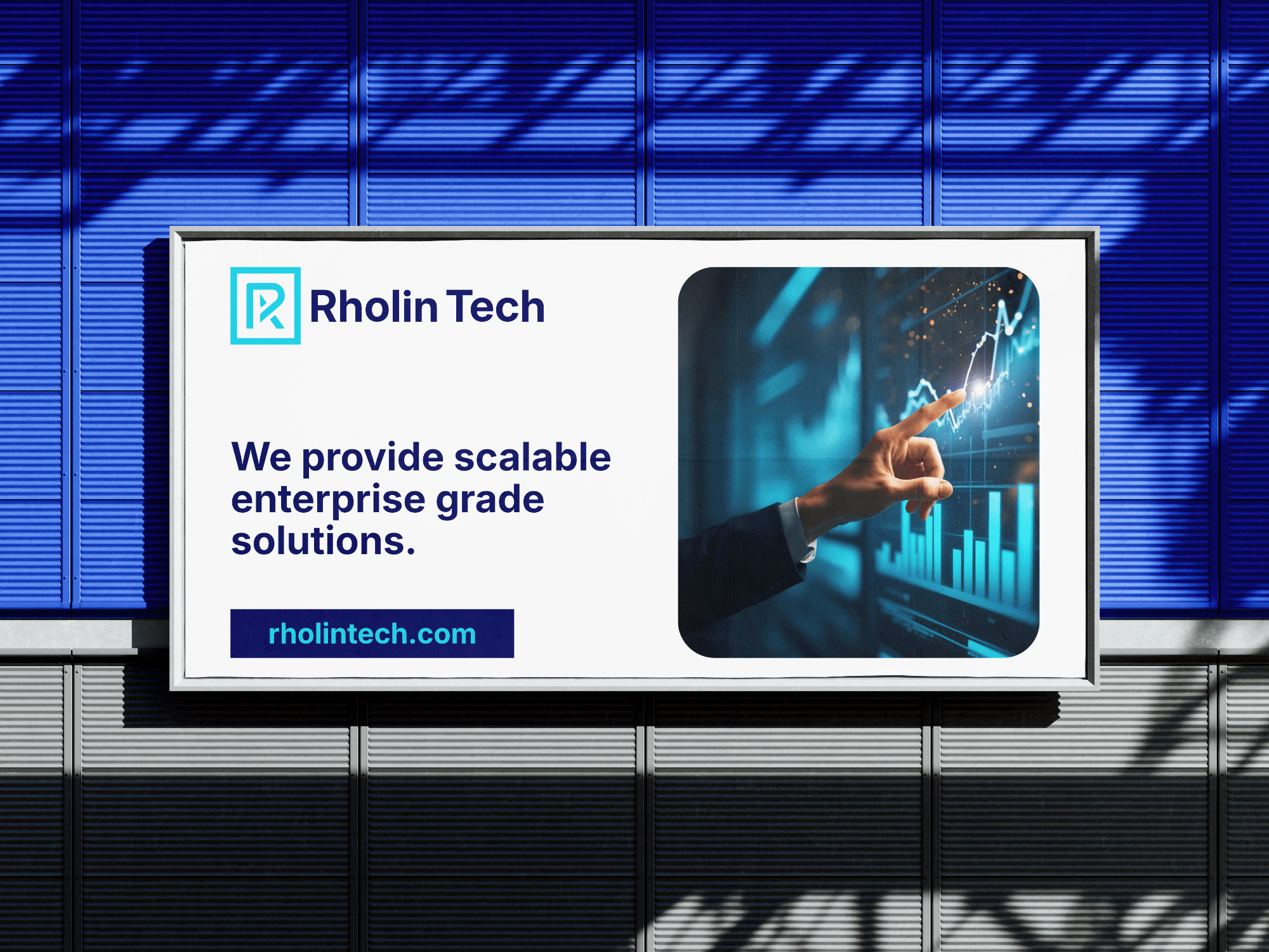
Phase 3: Brand Touchpoints & Advertising
To support the brand launch, the identity was rolled out across several physical and promotional mediums:
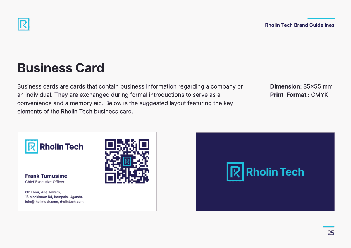
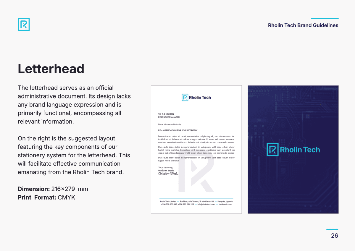
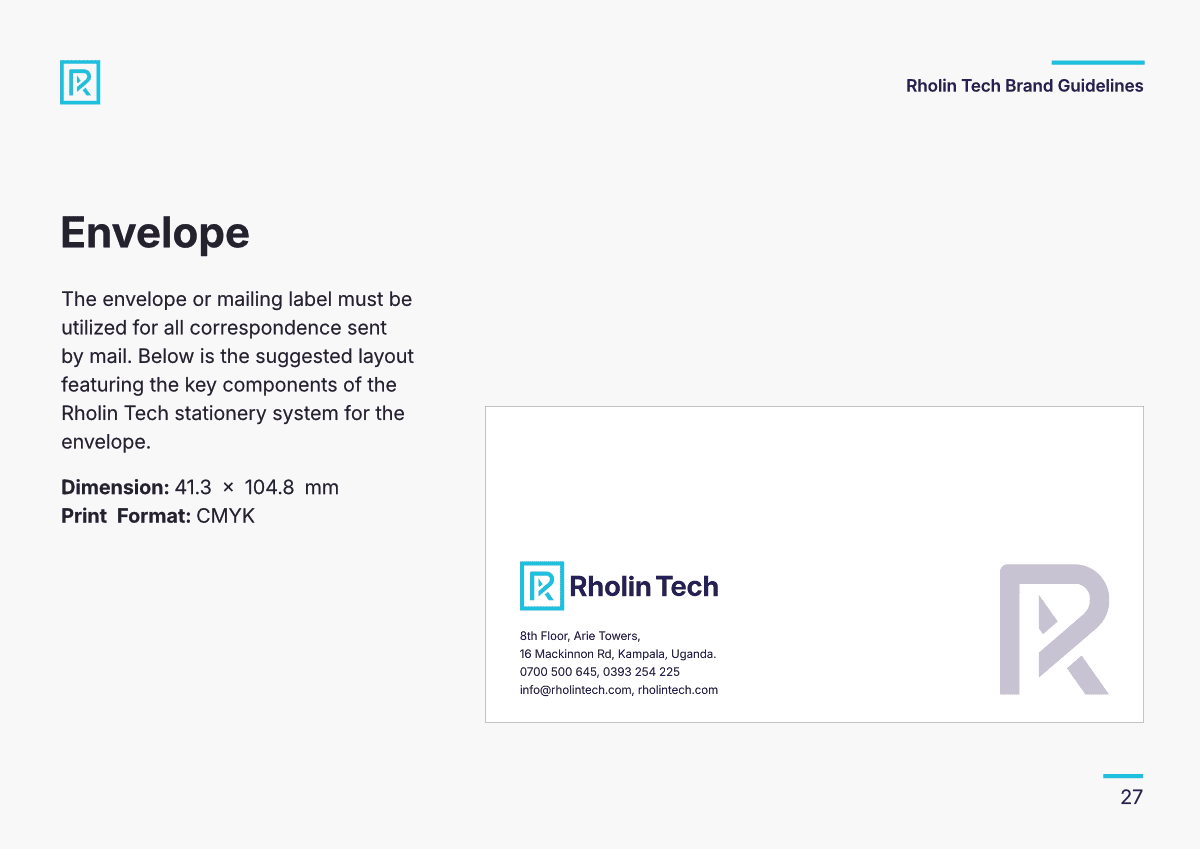
- Stationery: Functional design for business cards, letterheads, and envelopes that reinforces corporate authority.
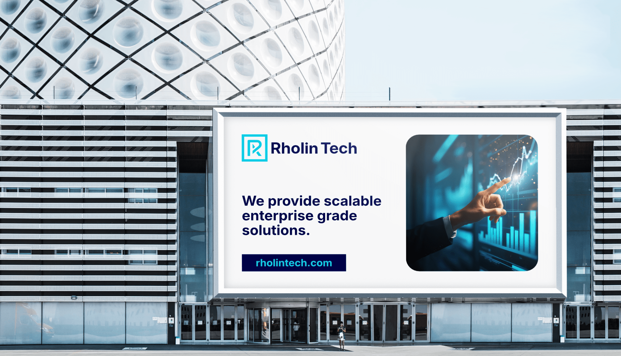
- Advertising: Succinct informational flyers and high-impact billboards designed for “instant recognition” in the marketplace.
The Result Rholin Tech now possesses a unified, professional identity that positions them as a trusted partner for government and private sector projects worldwide.stomer engagement.


Visit Website Here